I’ve taken an extended break from writing September and January NYC gallery round-ups, but a bunch of New Year shows caught my attention, so I’m back on the beat:
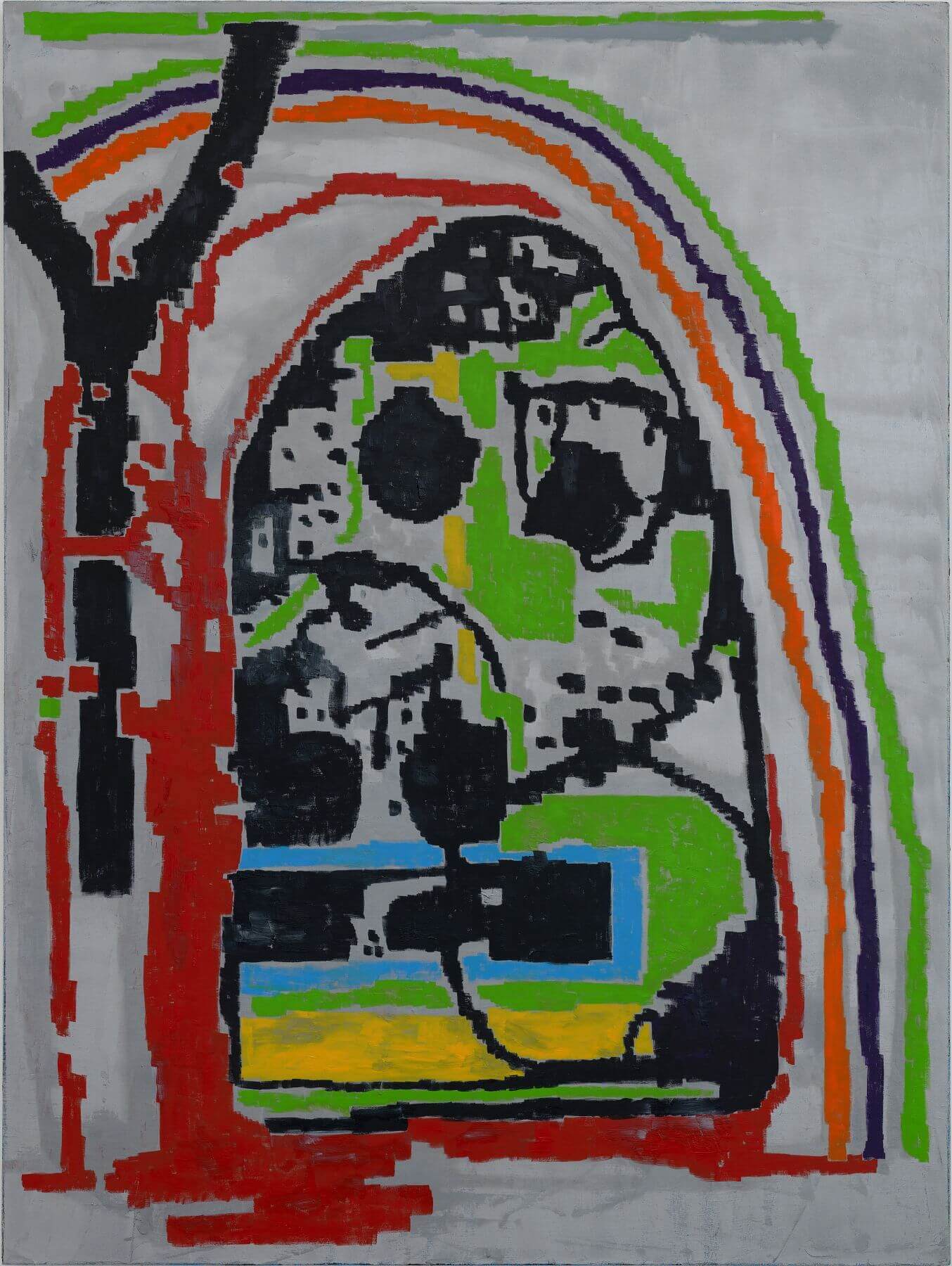
Big, goofy figures are hanging in galleries all over New York right now, but if I were to point to a secondary trend, it would be the depiction of 8-bit pixelation that simultaneously refers to its analog counterpart, the woven textile. I’m old enough to remember when Space Invaders was a new thing (I liked it a lot) so I guess I’m predisposed to painting that hits that particular note. EJ Hauser has been generally ahead of the curve on that approach, and her current show at Derek Eller is called Barn Spirits. In keeping with the title, the press release talked a lot about nature, of which I apprehended very little. What I saw was Nintendo, Raw Magazine in the ‘80’s (Google it) and the off-register printing so common to photocopied punk zine culture – all of which I find vastly more interesting than nature. I enjoyed the show very much indeed, but if I had one complaint, it would be that the corners were often uninvolved in the paintings that featured large shield or egg motifs. The shapes themselves and their intricate contents were extremely satisfying, but I would have liked to see them in a little more of a setting. Of the more completely resolved compositions, my favorite was definitely The Second Garden Secret (2018). Making metallic paint appear spatial is no mean feat, and Hauser’s various silvers are sometimes hard as chrome, only to dissolve into a grey mist that surrounds the central motif. The latter, built of hiccupy lines in primaries, secondaries, and black, could be construed as a mountain and tree (if nature is your thing) but could just as easily be seen as a mutated cousin to Donkey Kong. I liked this painting a lot.
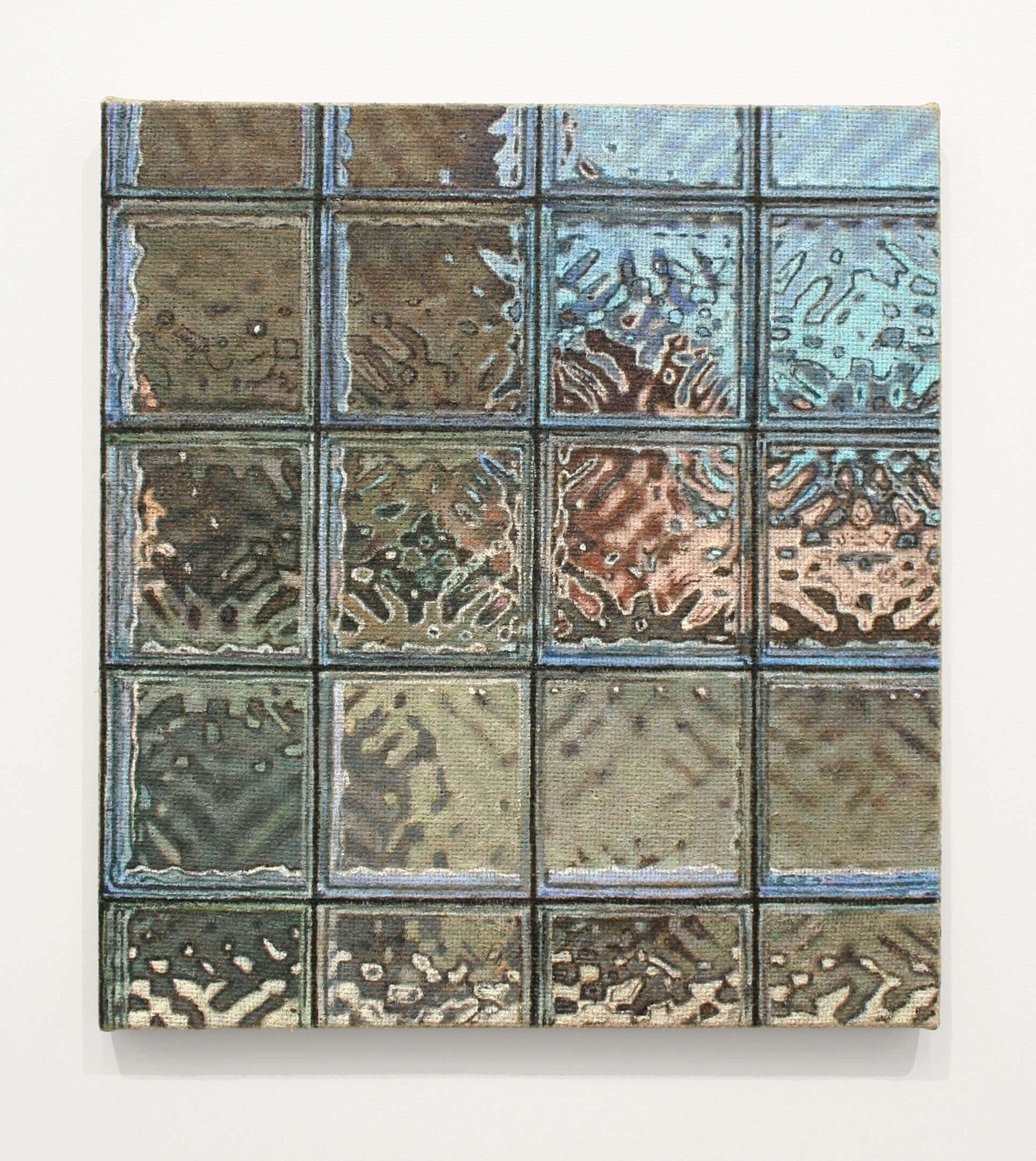
In her current show at Klaus von Nichtssagend, Jennifer J. Lee also evokes the pixel by painting on extremely coarse jute – the weave of the material together with a moderately dry brush creating the lo-res effect. To me, these paintings were at their best when the depicted subject had a surface that was absolutely opposed to the fabric on which it was painted – things like plastic chairs, brass horns, and various kinds of glass. Window III (2018), the largest painting in the show at 21” x 19,” was quite amazing, creating an extremely convincing illusion of glass brick, with an indistinct landscape visible outside. In a 101-level painting the class, one of the first things one learns is that surfaces should be prepared according to what you’re planning to paint on them – Lee turns that formula on its head to very good effect. That particular painting, more so than any other in the show, also makes a strong nod toward abstraction; the grid is completely frontal, lines up precisely with the left-hand edge, and the proportion of the individual glass bricks is roughly the same as the overall shape. As much as I enjoyed the show, the paintings of landscape, bereft of that weird contrast between subject and surface, didn’t resonate quite as strongly.
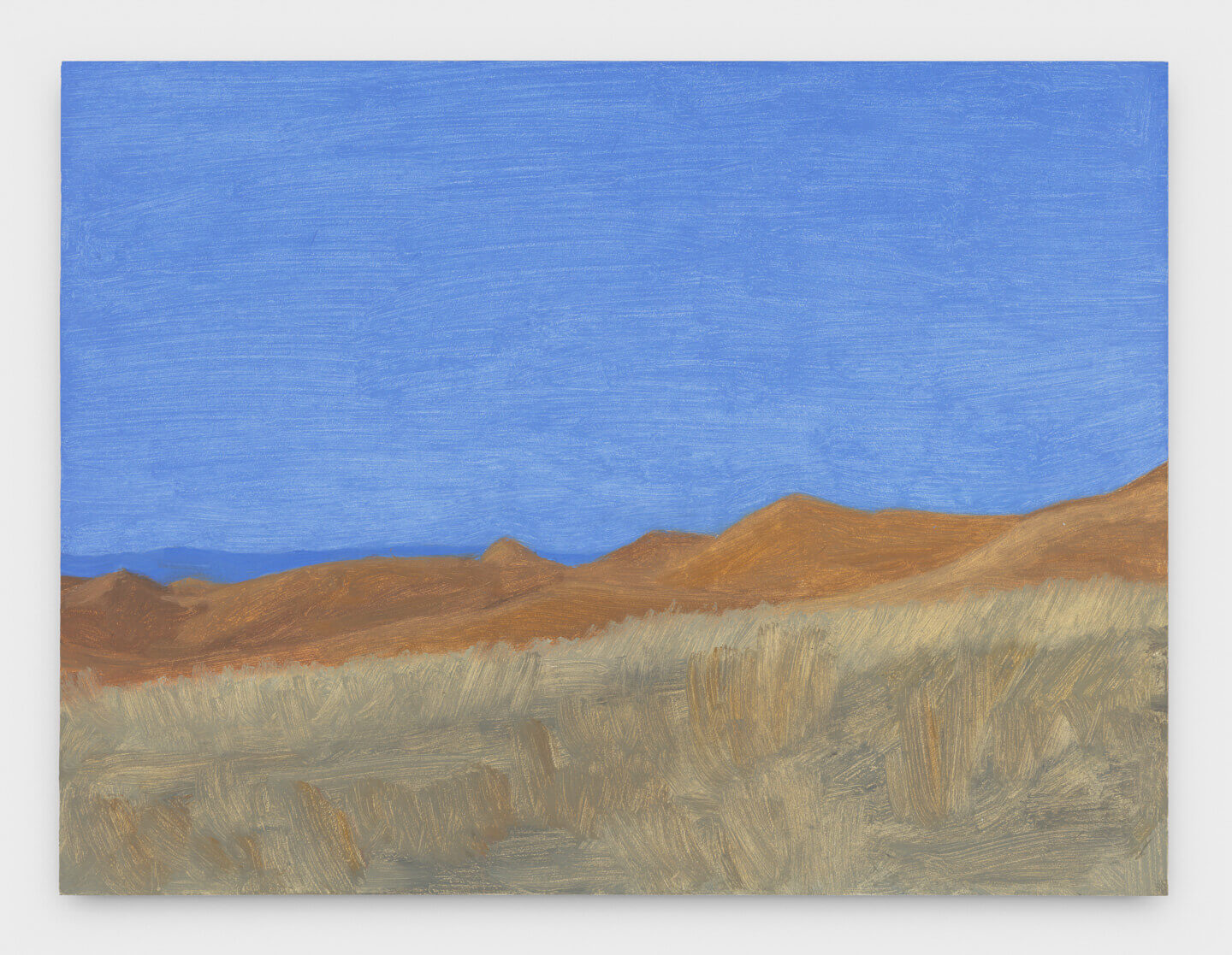
In Minimalism and the Rhetoric of Power, Anna Chave’s seminal critique of the fascist tendencies in that particular style,* she writes: “For works of art to be powerful and aggressive was, from the Minimalists’ standpoint, an unproblematic good, almost as it was once self-evident that art should be ‘beautiful.’” But what happens when those very works are themselves depicted in intimate, lyrical, and extremely beautiful paintings? Eleanor Ray does just that in a large group of tiny paintings currently on view at Nicelle Beauchene. I’m going to try not to use the word beautiful too many times in this particular paragraph, but these little paintings were heartbreakingly so. The Judd and Smithson references are certainly a nice twist, but the fact is, these pictures don’t really require that dissertation-ready component – they stand up quite nicely on their own. My favorites were generally the ones that combined architecture and light to make a somewhat minimalist grid, like Wyoming Window, June (2018), but the Morandi-esque Wyoming Hills, Dawn (2018) prominently featured a sky painted a particular blue that counts as among the most remarkable I’ve ever seen (really). To make a picture that simple be so very compelling bespeaks a very special talent. Just beautiful.
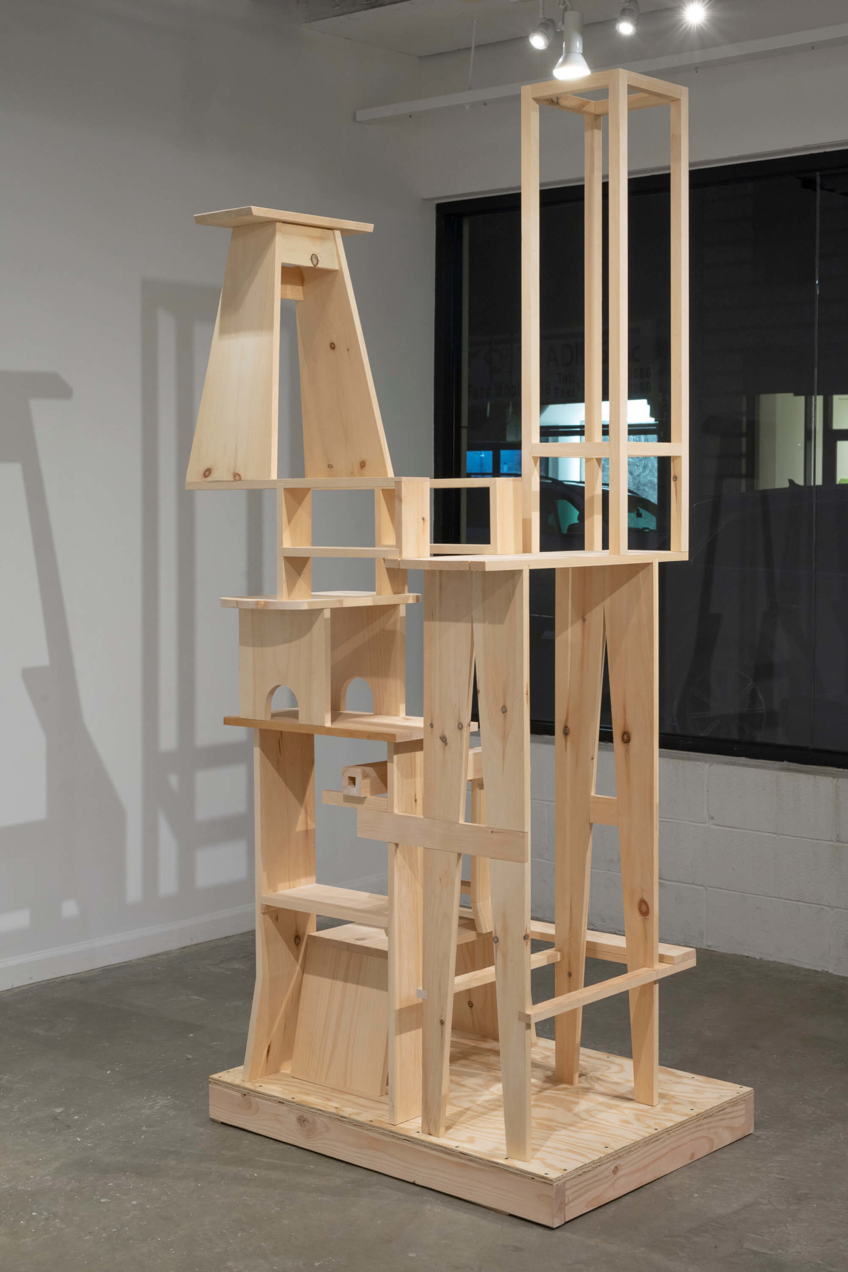
Veteran sculptor Jim Osman offers his own gentle spin on minimalism in The Walnut Series at Lesley Heller. I generally confine my ruminations to painting, but I’ve written about Osman’s work several times in the past – my way in has always been through his use of color. In sculpture, color can often look like a skin or an afterthought, but Osman has a special ability to make his colors look intrinsic to the material even when it’s clearly applied to its surface. He’s become so adept in that category that he can now play with the in-the-piece vs. on-the-piece approach within the same sculpture. In Maroon (2018), an assortment of small colored blocks support three pieces of walnut, the uppermost of which has on its surface what could only be called a painting. In my description of his working method I chose the word play quite specifically, because the main part of the gallery, which is full of small-scale inventions on equally inventive pedestals, feels a lot like Geppetto’s workshop. The star of the show is the large scale Still (2018) in which Osman chooses the more traditional minimalist approach of using only the natural color of the materials – in this case pine and plywood. But once again, play is the operative word – quirky joinery and references to stacked furniture that sometimes hints at the anthropomorphic keep the piece from becoming too grave, instead conjuring domesticity and sly humor. There is no imposing rhetoric of power, even though I find the piece very powerful, in a welcoming way.
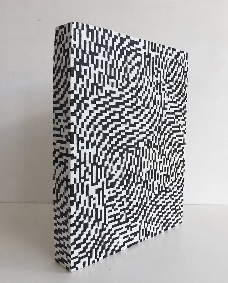
A few blocks away from Jim Osman’s painterly sculptures, Robert Otto Epstein has an exhibition of sculptural paintings (I think) at High Noon gallery. The painted cement vase shapes one finds there are fundamentally frontal and have a depth not much thicker than extra-wide stretcher bars. The artist told me that he had actually considered hanging them on the wall, but the weight of the pieces was too great (the show is called This Is Heavy). For me, the table-top presentation was definitely the way to go, because the work’s objecthood is too front and center to be presented as bas relief. In the entrance gallery, the pieces are covered with gridded hieroglyphics, but in the main space the application of color, sometimes black and white, sometimes in a candy-colored rainbow, brings me back to where I started this essay – the pixelated low tech video game motif is used to great effect here, and the flickering light that it suggests keeps the pieces from looking and feeling like they weigh a ton, even though they do. While I very much enjoyed the vase shapes, I felt a special affinity for e%75fH8190z? (2018) which took the form of a little black and white tombstone sitting on the floor and in the corner, like it was being punished. I know it’s weird to feel empathy for a block of cement, but what can I say?
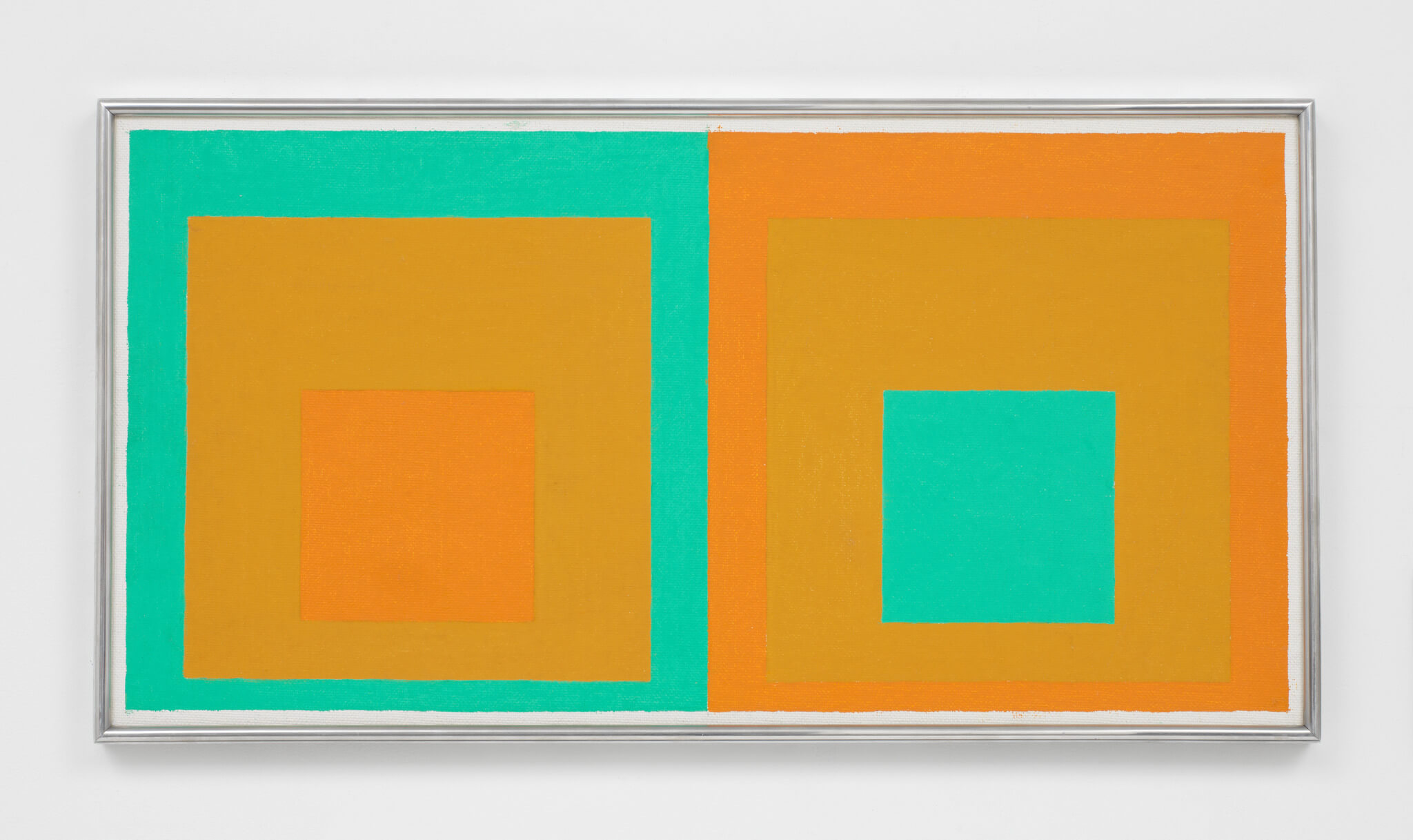
David Zwirner hung a wonderful, museum-quality Josef Albers show at the mega-dealer’s 20th St. location in Chelsea. The show is called Sonic Albers, and seeks to explore the artist’s relationship to music – an apt theme, but in point of fact, all of Albers’ work is related to music (in fairness, this is pointed out in the press release). So much of the language and terminology in the seminal book, Interaction of Color, is borrowed from music theory, and the way that Albers thought about color intervals was quite consciously musical. I never tire of the Homage to the Square series, and there were an awful lot of beauties here, along with some studies, too. A pleasant surprise was Double Homage to the Square from 1957, in which the signature motif was presented side by side. Two oranges and a bright green in very close value alternate positions; on the left, the green acts as a frame, on the right the central motif. It glows and pulsates like op art, but a good many years before that style would rise to prominence. The record covers were a lot of fun, too – it’s important to remember that the Bauhaus crowd thought of art and design as being a closely related endeavor.
In brief, before I wear out my welcome:
Theresa Daddezio has three luminous canvases in a three-person show in the project space at DC Moore (along with Beverly Acha and Jim Gaylord). Her writhing, pulsating, squirmy, striped tube motifs look like they’re lit from inside. They’re very playful, but they’re not a joke. Angela Heisch has three paintings in a two-person show at Transmitter in Bushwick (along with Alessandro Keegan). She works with a gouache/acrylic hybrid in a cross-hatched, egg tempera style, and without using any transparent paint, she creates an illusion of transparency that borders on the photographic. The motifs themselves call to mind backgrounds from the later era Warner Brothers cartoons (remember Marvin the Martian?). Jordan Nassar has two pieces in the politically-minded Borders group show at the Chelsea branch of James Cohan, and another at Cohan’s Lower East Side location. The works features Whitman Sampler-style embroidery – the original 8-bit technology – and the superimposition of landscape over pattern using such limited means was impressive. If someone had described these things to me without my having seen them, I would have guessed it was a gimmick, but it’s not – they were easily the best pieces both shows.
Paul Corio
January 2019
EJ Hauser: Barn Spirits is on view at Derek Eller Gallery until Feb. 3, 2019.
Jennifer J. Lee: Day Trip is on view at Klaus von Nichtssagend Gallery until Feb. 10, 2019.
Eleanor Ray is on view at Nicelle Beauchene until Feb. 10, 2019
Jim Osman: The Walnut Series is on view at Lesley Heller Gallery until Feb. 17, 2019.
Robert Otto Epstein: This is Heavy is on view at High Noon until Feb. 3, 2019.
Josef Albers: Sonic Albers is on view at David Zwirner until Feb. 16, 2019.
Three: Beverly Acha, Theresa Daddezio, Jim Gaylord is on view at DC Moore Gallery until Jan. 26, 2019.
Heed: Angela Heisch, Alessandro Keegan is on view at Transmitter until Feb. 10, 2019.
Borders is on view at James Cohan until Feb. 23, 2019.
Notes
* Chave, Anna. “Minimalism and the Rhetoric of Power.” Arts Magazine, vol. 64, no. 5, Jan. 1990, pp 44-63.
