I’ve been writing these September round-ups for a few years now, and I’ve almost always prefaced them with some note of astonishment at the sheer amount of abstract painting I was seeing in the galleries. I usually followed that with a reminder of just how little of it there was in the 90s and most of the naughties. But I’m making a few little changes starting now.
Painting has been back in the limelight long enough that those reminiscences are starting to become distant memories, war stories of a kind that make my painter friends under 40 glaze over – what the hell do they care about the days when everyone thought Matthew Barney was God and the Biennial was a series of video booths that resembled a peep show? Like my young friends who didn’t live through that, I’m just going to look back on it with a shrug, if at all.
The other small change is that I want to discuss some painting that isn’t strictly abstract. I’ve been seeing more loopy figures and semi-abstractions that interest me, and it just makes sense to broaden the discussion – it’s all painting after all.
So without further ado, here are some of the painting exhibitions that stood out from the crush of openings in NYC in September:
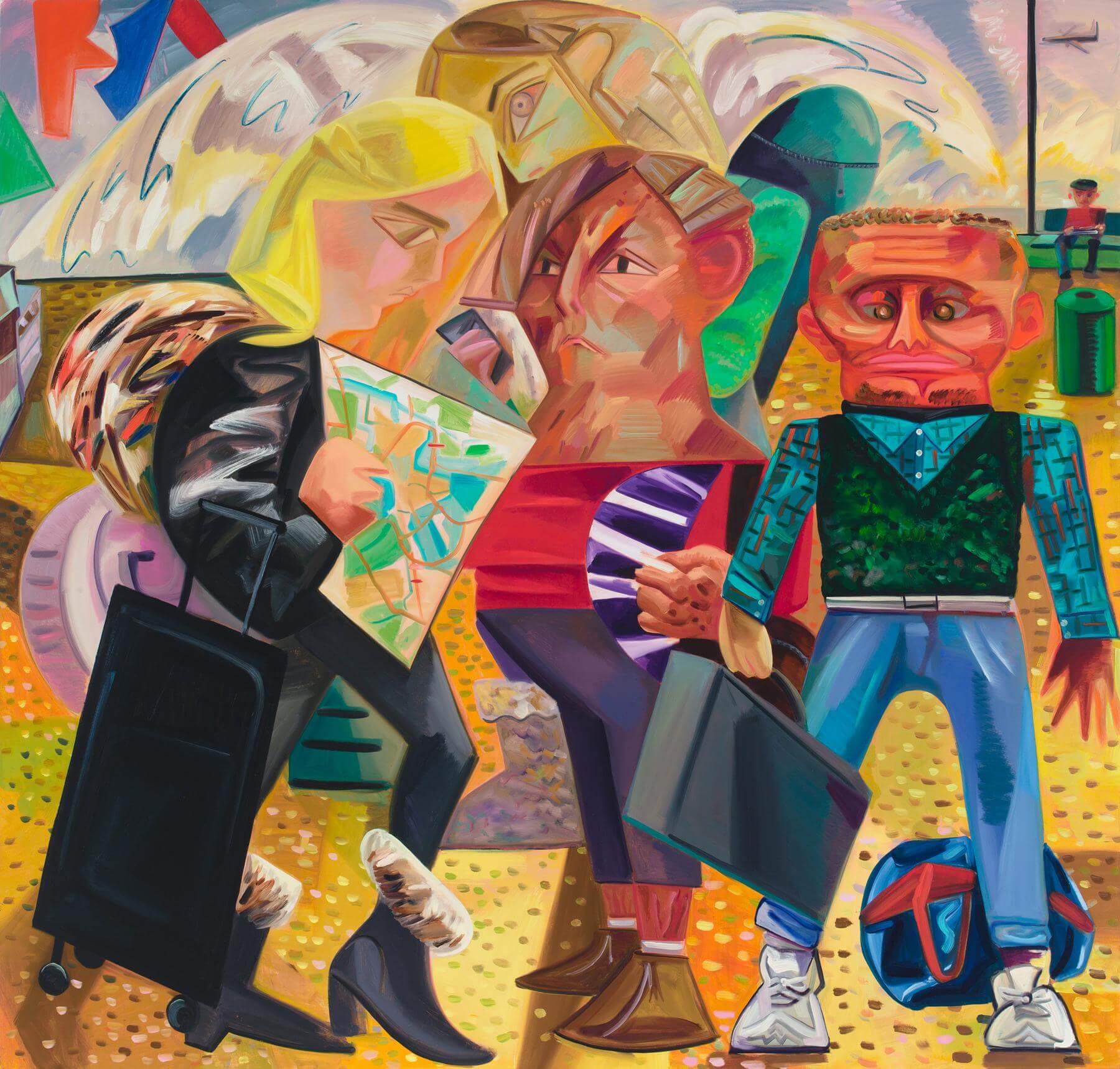
I’ve never counted myself a fan of Dana Schutz, so I was quite surprised to discover that her show at Petzel was my favorite of the month. My memory of her Young Art Star period consists of muddy paint and cut canvas – grad school stuff – but the big, lush, confident paintings in the Petzel show fly in the face of those recollections to such an extent that I’m not sure if I remembered wrong or she got an awful lot better. She can make lightning-like strokes that don’t turn the color to mud, then slow things down with cubist hatching, then render in the manner of Manet. The structure throughout the show is fundamentally cubist, which is to say the four sides are trying to convince all of the motifs to correspond to their rectangularity, but the pictures are no retro history lesson – she’s done her homework, but turned it into something her own. The compositions are organized not only around their goofy figures, but around blocks of similar color or value, which form a matrix somewhat apart from and parallel to the ensemble of characters and props. This is especially evident in Swiss Family Traveling, in which the crazy quilt of color zones evokes Bonnard.
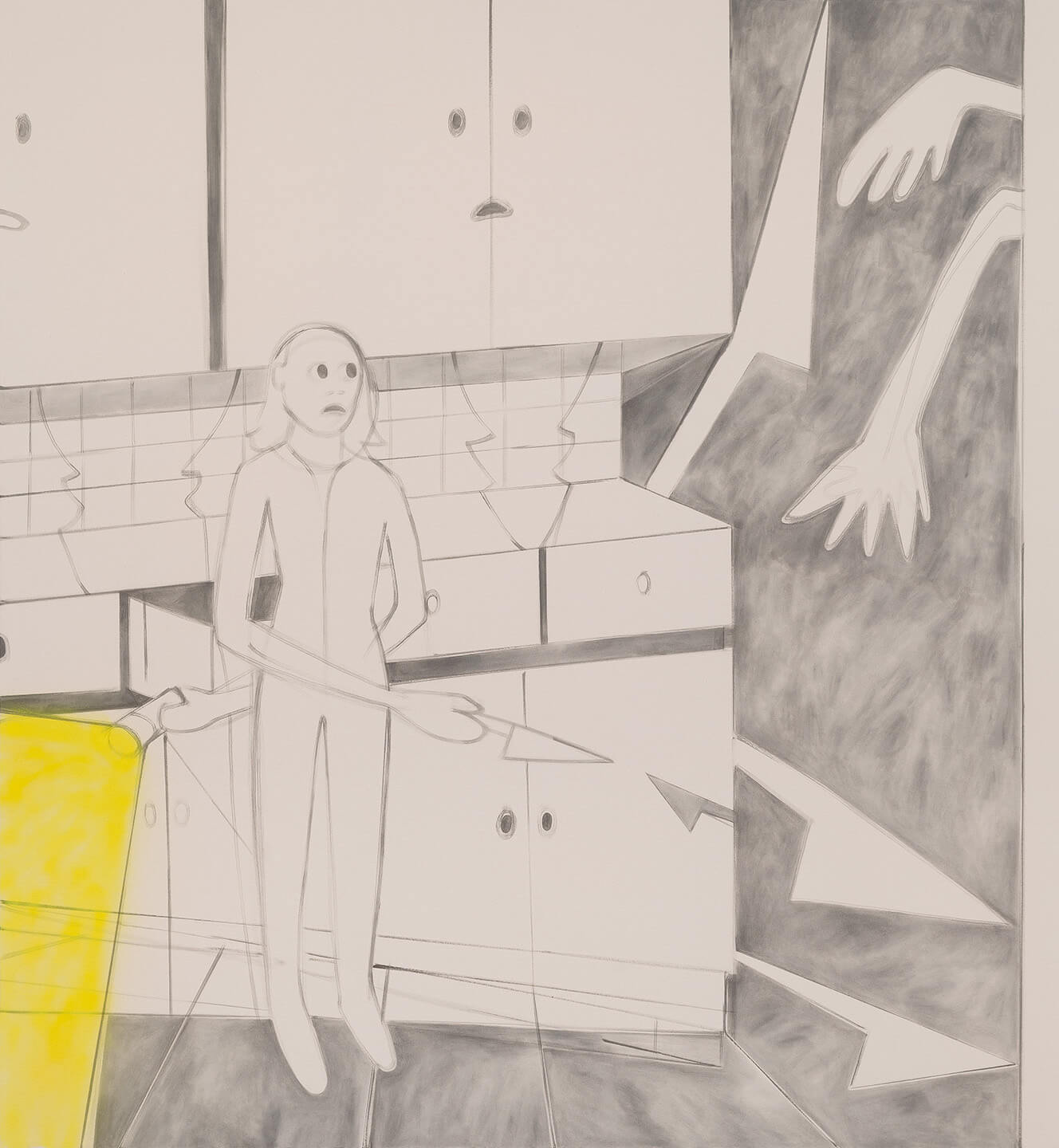
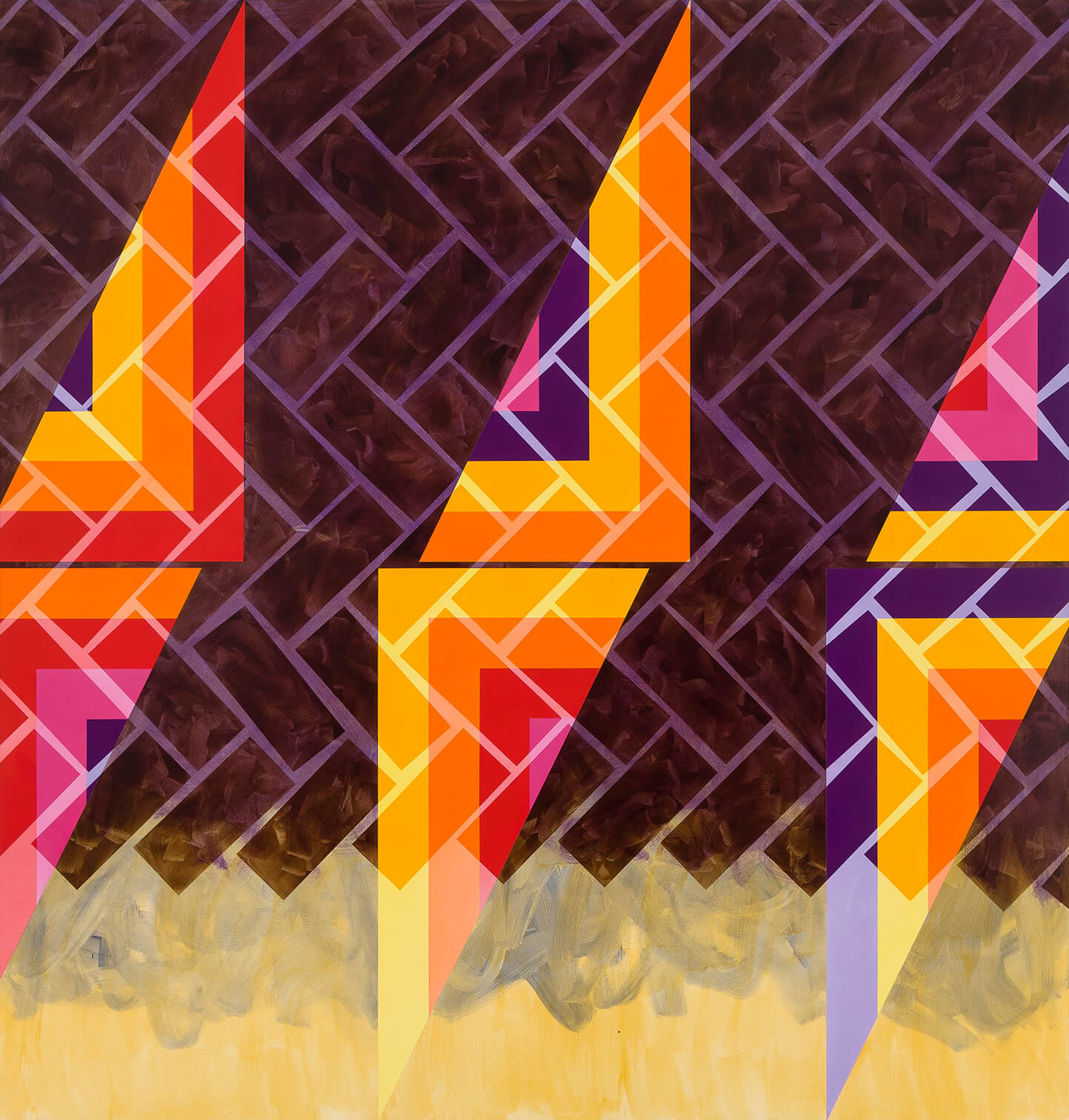
More kooky figures can be found alongside colorful hard-edge abstractions in Jaqueline Cedar and Nate Ethier’s two-person exhibition at Brian Morris Gallery and Buddy Warren Inc. (this is one place). I puzzled for a long time as to why this pairing worked so well – on paper, Cedar’s playful dreamscapes and Ethier’s high-key geometry would seem a rough match. But not unlike Dana Schutz, Cedar’s paintings’ rectangular edges have a kind of gravitational pull which yank her figures into a semi-perpendicularity. Within that soft grid, lightning bolts, arrows, and knives fly around obliquely, setting things in motion and speaking to Ethier’s carefully placed diagonals, especially the pointy ones. My two favorite pictures in the show were also the ones that I thought complemented each other best. Cedar’s Time in Thinking shows a nervous looking woman in a kitchen with nervous looking cabinets. She’s holding a knife but other daggers of the mind float in the air along with what are presumably the arms of an intruder. The whole picture exists in a soft atmosphere of light grey and white save for the beam of the flashlight she holds, which is a singing, stinging lemon yellow. Those knives find their corollary in the especially impressive Hike by Ethier. Opposing triangles in bands of saturated color are overlapped with a transparent herringbone pattern of brick shapes, all of which are wading in a sea of yellow at the bottom of the picture. Don’t even try and distinguish foreground from background, just let your eyes float through it.
In Terry Haggerty’s new show at Sikkema Jenkins, his signature ribbon motifs are placed on aluminum supports that extend out from the wall. This crafty bit a gamesmanship brings another level of play to his work; his curling bands have always visually eroded the solidity of the walls upon which they hung, but the new pictures accomplish this while also breaking the pictorial glass that ordinarily separates the viewer from the illusion. My only complaint is that the lighting should have been adjusted in such a way as to control and minimize the shadows – these paintings (?) are at their best when it takes a minute to figure out what’s real and what’s fictive. There were also flat pictures on shaped supports in the show, including a room full of small two-color paintings that were especially wonderful – Haggerty has always handled big scale confidently, but he can make it happen at a modest size as well. The mask-like Pragmatic Hold seemed to be looking back at you as it retreated into the wall.
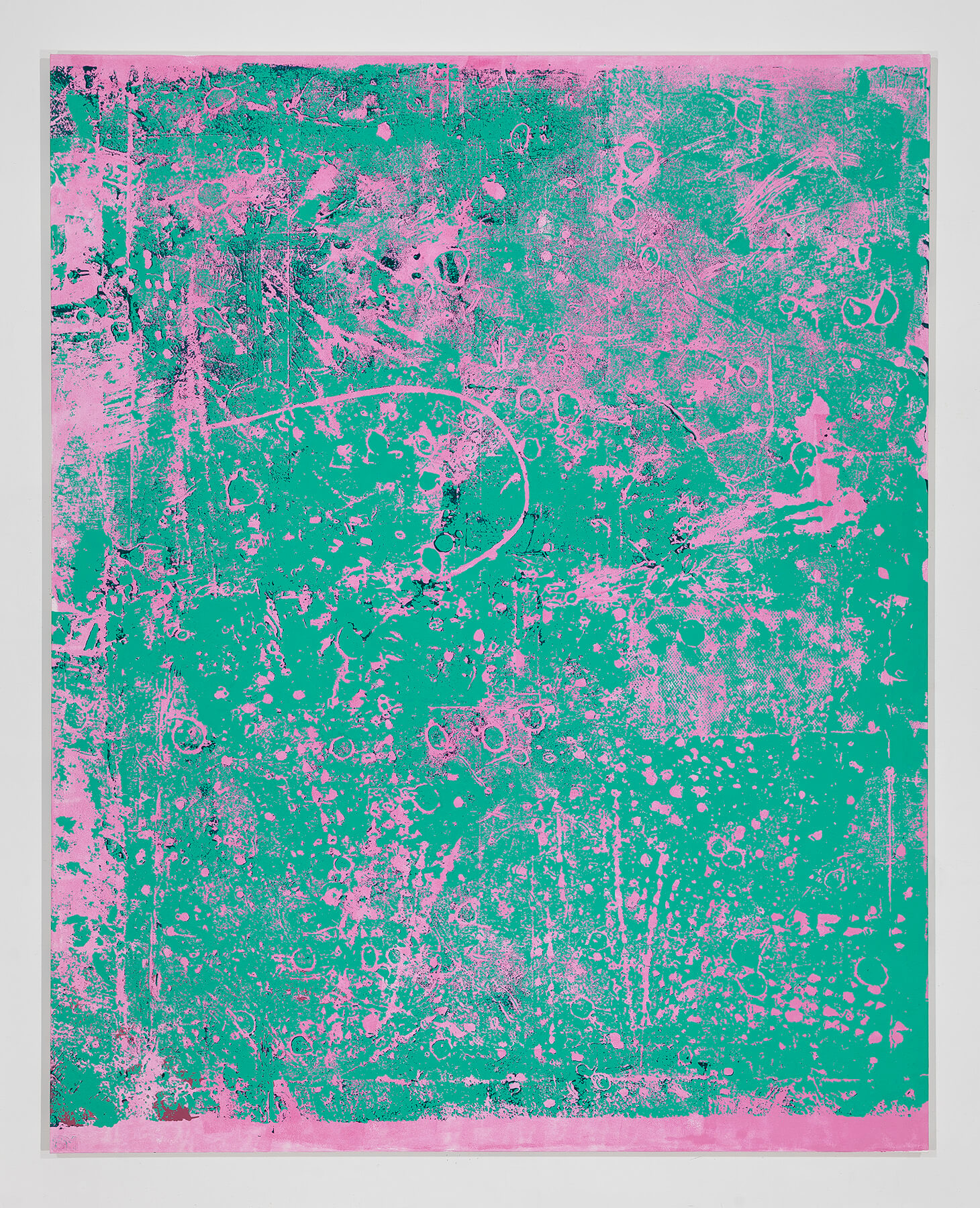
Stephen Maine, who currently has a solo exhibition at Hionas Gallery, has been quietly working out a language of process-driven abstraction for a number of years, experimenting with various methods of applying acrylic paint that defy easy identification – the pictures sometimes look like photos or photographically derived silkscreens, other passages resemble x-rays, some look like they were eroded by acid or exploit the resistance of oil and water. The resulting enigmatic images are the most prominent aspect of these all-over compositions, but the real glue is the color. Some are in tightly controlled, narrow value ranges – the light ones look backlit and the dark ones look spooky. Some are in colors that self-consciously clash in a loud-shirt, op sort of way. Each color grouping has its own emotional content, strongly influencing the kind of information that paint application supplies – pictures made with the same process might evoke a summer day or an MRI of a brain depending on the palette. The real stars of Maine’s new show are the two enormous paintings in the front room: P15-0701 and P15-0720. At an outsized scale, they begin to lose their identity as the result of a painting process and take on the attributes of natural phenomena – like landslides or cave interiors.
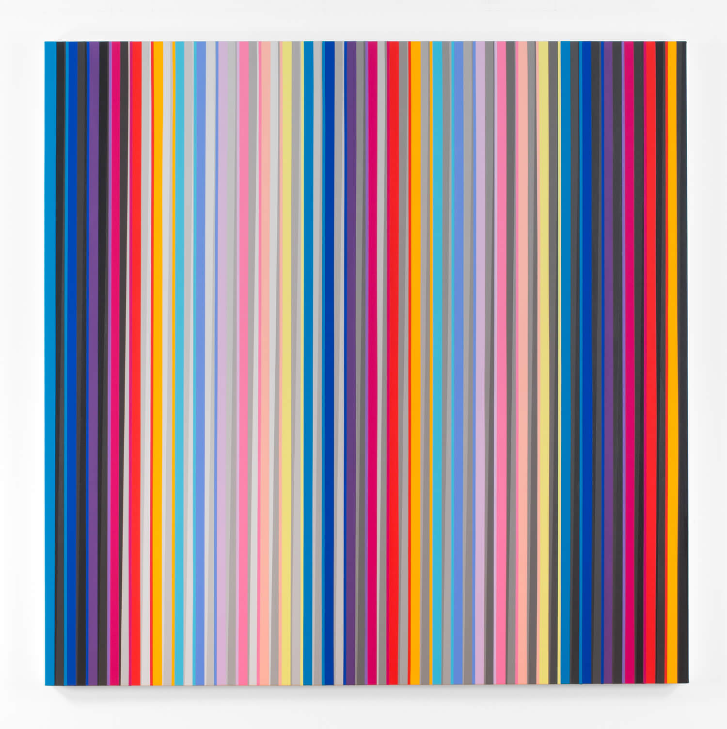
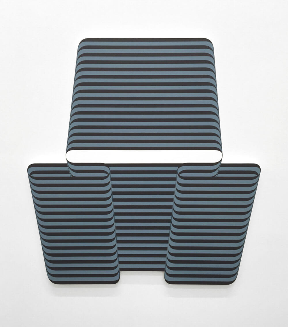
Gabriele Evertz’s work represents a life-long passion for the interplay of color. In the past, her paintings were most often laid out in repeating cycles, but in her current show at Minus Space, she takes a new approach to her signature vertical banding, making color decisions in an improvisational way as opposed to the systematic methodology of previous series. The results are impressive – the pictures visually oscillate between reading as flattened patterns, bevels and chamfers, and hollows with cast shadows. They have a spiritual relationship to Gene Davis, not only because of the vertical bands, but because they continue to surprise as you scan them left to right – just when you think you have a handle on their logic, they subtly shift. Evertz departs from Davis in two significant ways; first, in her continual use of sequential greys with their attendant illusion of optical “fluting,” and also with the long diagonal subdivision of her vertical bands – some of the stripes are not stripes at all, but attenuated triangles, which subtly reference both perspective and motion. I liked every picture in the show, but my favorite was Intensification (Come Closer), in which three clusters of highly saturated stripes were separated by two columns of pale tints – the picture seemed to be inhaling and exhaling as the eye moved across.
I don’t like to make readers suffer my prose in excess of 1500 words, so very briefly:
From his thumbprint pictures to his more recent blob-and-hot-dog paintings, Chuck Close’s gridded work has always resembled the kind of mosaic one sees in witness protection videos or Japanese porn movies, even though he never actually painted them to look like a strictly digitized grid. In his current show at Pace, however, the paintings actually resemble internet thumbnails clumsily manipulated in Photoshop and then blown up to a huge size. I loved them. If you like op and color field painting, run don’t walk up to D. Wigmore Fine Art, where there’s a solid show of 60s hard edge painting. Gene Davis’ Royal Veil from 1971 was a showstopper, and the three Paul Reed canvases were nice surprises from a seriously under-recognized figure. Besides being a process-driven painter himself, Stephen Maine along with sculptor and significant other Gelah Penn have organized a show of process-oriented painting and sculpture at the Fiterman Art Center at BMCC. The show is called Dipthong and features a boatload of interesting work (the gallery is enormous) but the highlights for me were two paintings by Anoka Faruqee and four by Michael Brennan – both are artists I have a huge amount of respect for. Dan Christensen was given a mini-retrospectives at Berry Campbell – it was uneven to be sure, but those swirling spray-gun paintings are killers, and Dorado from 1968 is worth the trip. Frank Stella was also given a mini-retrospective around the corner at Kasmin. There were a lot of his big weird things, and no black or aluminum paintings (oh, well) but Flin Flon from 1970 was impressive, and much better than I remember that series being – it’s important never to make any serious judgments of painting based on reproductions.
Paul Corio
New York City
September, 2015
Dana Schutz: Fight in an Elevator is on view at Petzel Gallery from September 10 – October 24, 2015.
To the Edge: Jaqueline Cedar and Nate Ethier is on view at Brian Morris Gallery and Buddy Warren Inc. from September 9 – October 11, 2015.
Terry Haggerty is on view at Sikkema Jenkins & Co. from September 10 through October 17, 2015.
Stephen Maine: New Paintings is on view at Hionas Gallery from September 9 – October 4, 2015.
Gabriele Evertz: The Gray Question is on view at Minus Space from September 12 – October 31, 2015.
1960s Hard Edge Painting is on view at D. Wigmore Fine Art from September 10 – November 10, 2015.
Dipthong, curated by Stephen Maine and Gelah Penn, is on view at the Fiterman Art Center at BMCC from September 29 – Novemeber 14, 2015.
Dan Christensen: A Retrospective is on view at Berry Campbell from September 17 – October 17, 2015.
Frank Stella: Shape is Form is on view at Paul Kasmin Gallery from September 10 – October 10, 2015.