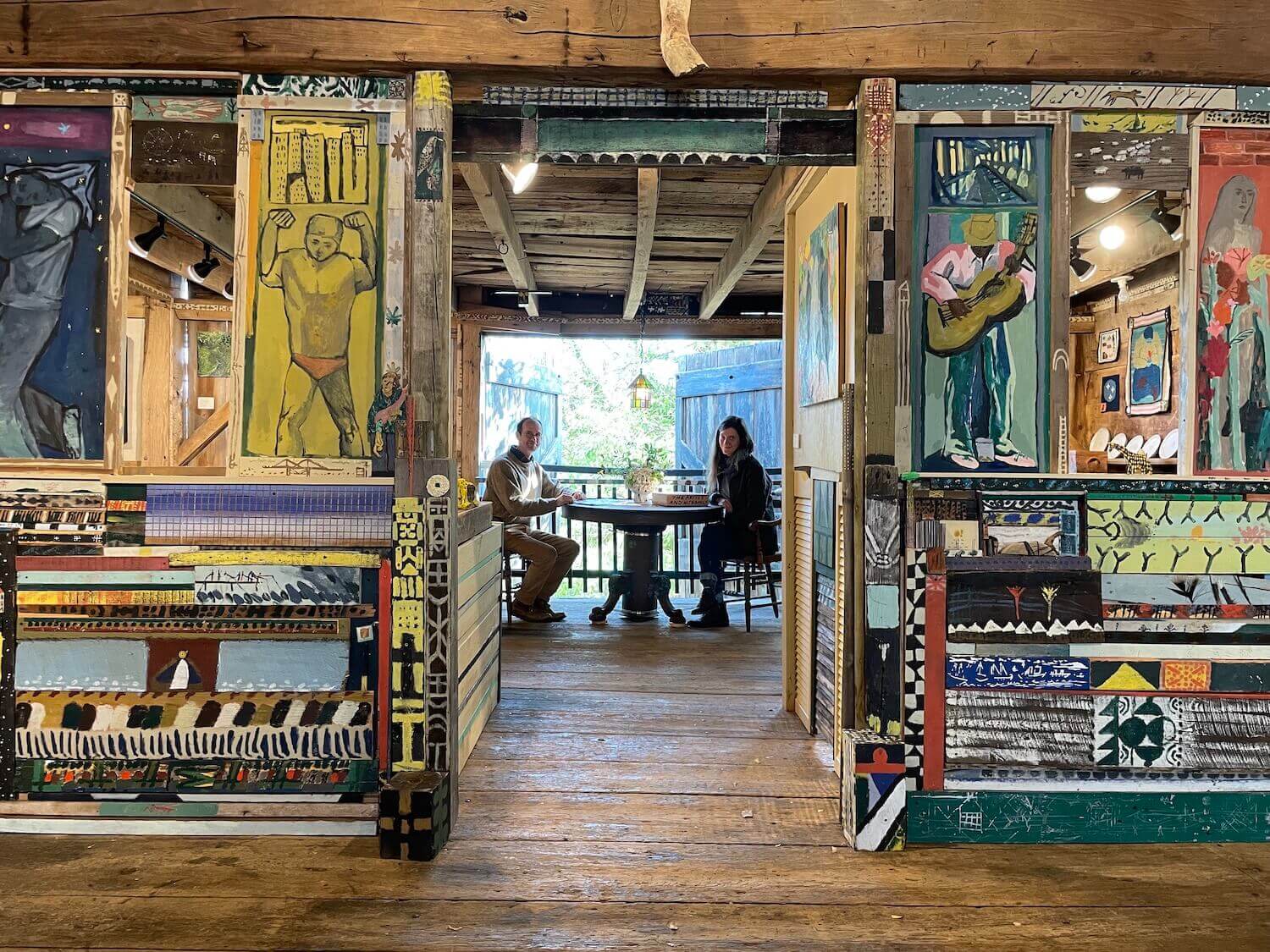
About
Far from the white cubes and art fairs, Alex Cohen and Clara Weishahn have hand crafted an international exhibition where art rejoins the rhythms of daily life and is a catalyst for community.
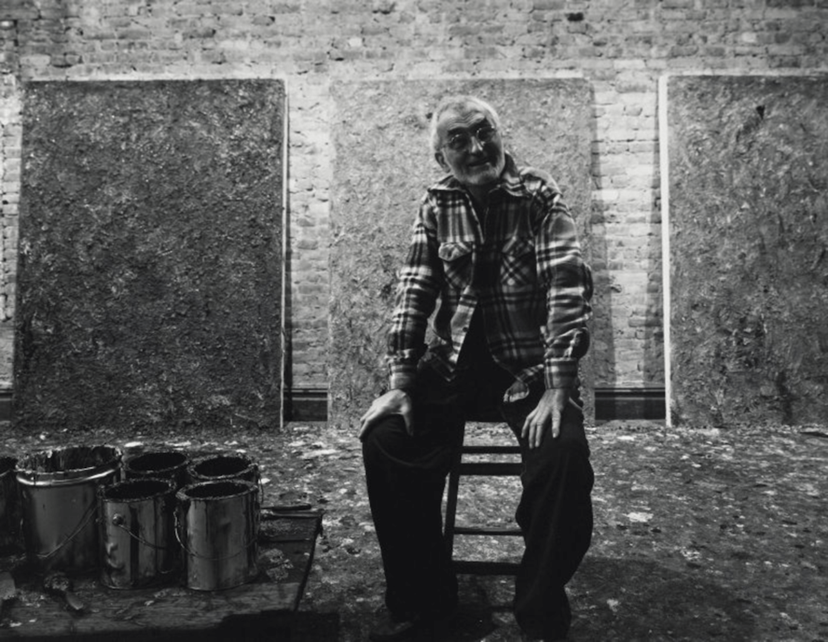
by Brett Baker
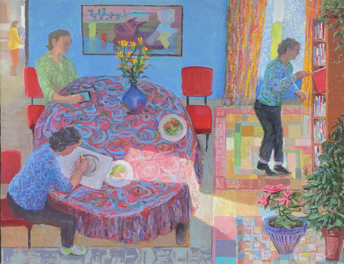
In Larry Groff's recent paintings, visions of contemporary reality give way to surprising optimism.
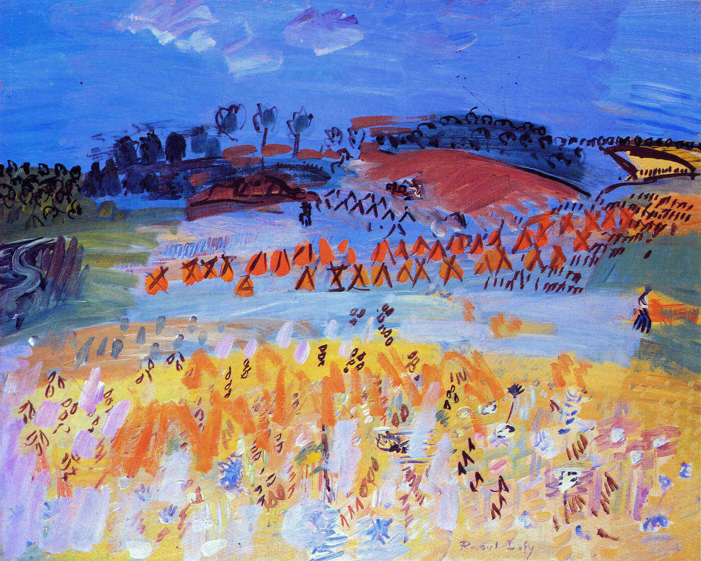
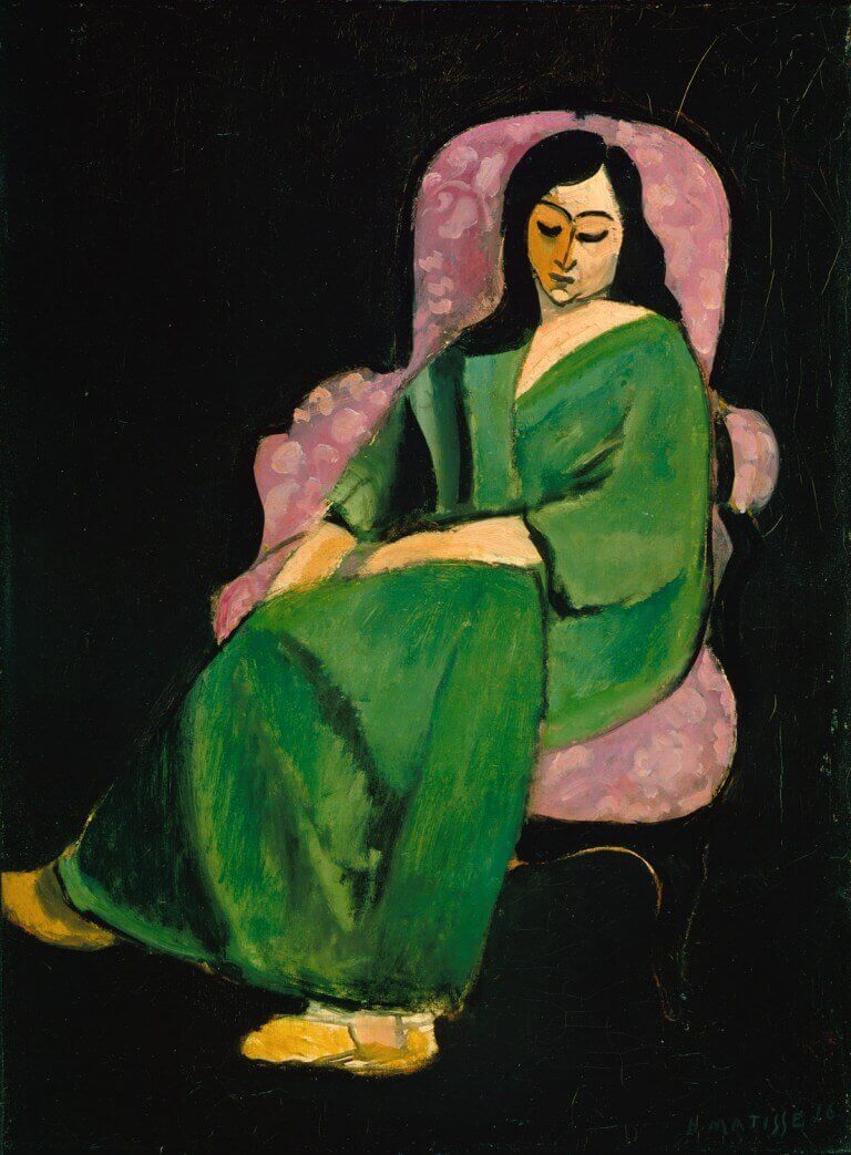
In thinking about the work of his favourite painters Sargy Mann realised that Raoul Dufy was the most extreme example of the separation of line and colour.
by Sargy Mann