Sponsor: Golden Artist Colors
P
ainters’
T
able
Magazine
About
Search
Best of PT
Reviews
Studio Visits
Artist Writings
Catalogue Essays
About
Magazine
PT Feature
Search
PT Feature
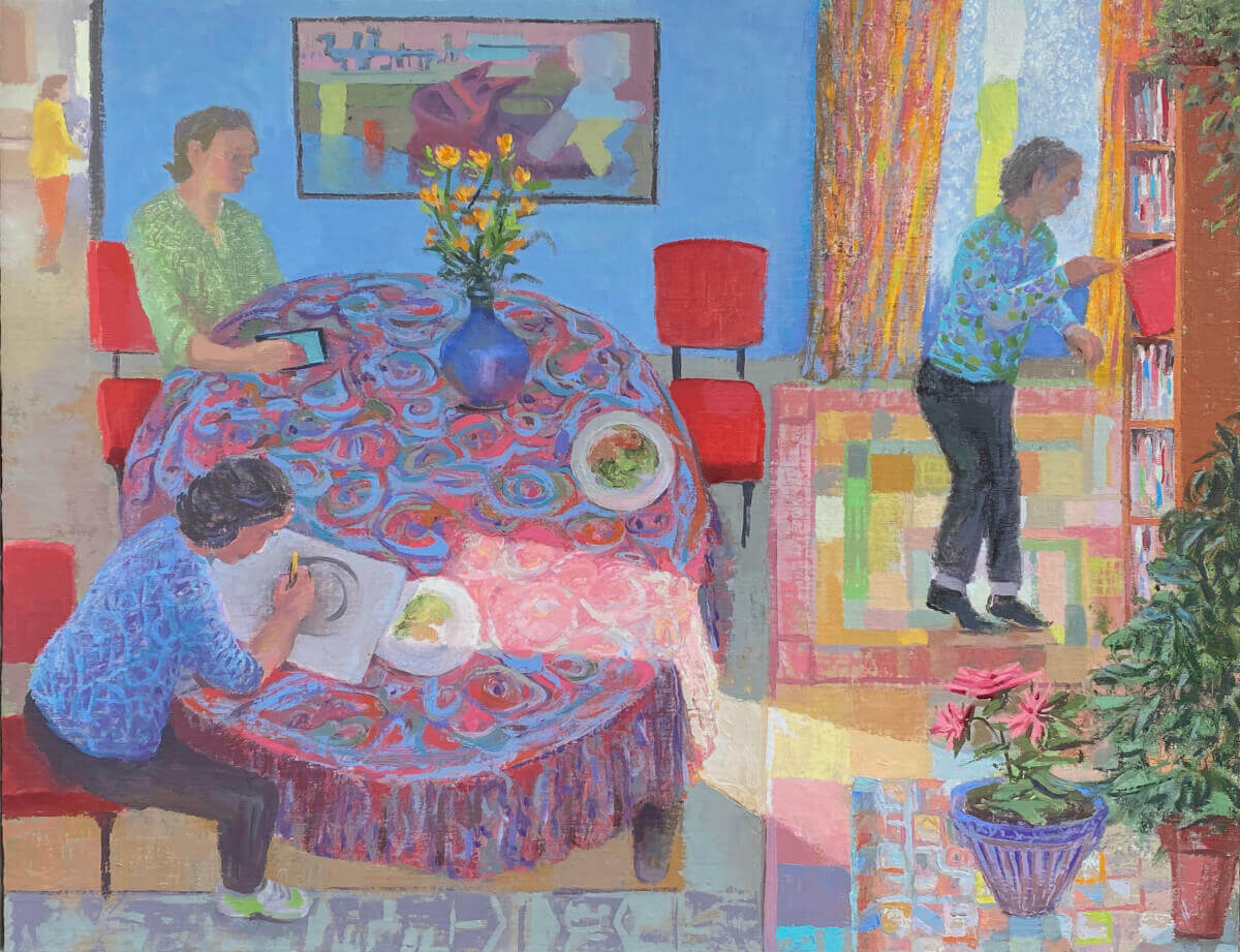
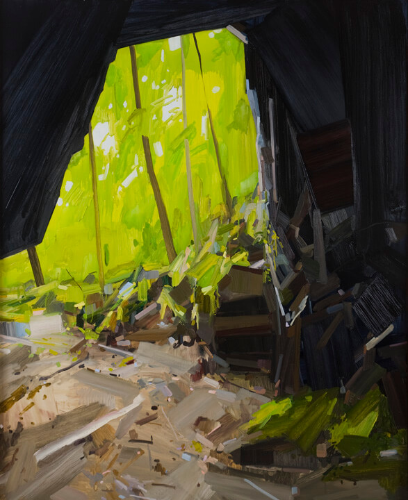
Larry Groff at Prince Street Gallery
PT Feature
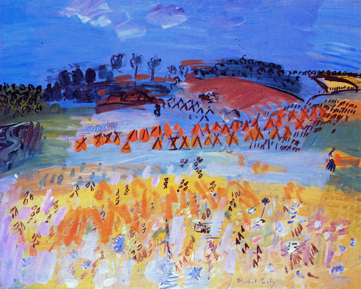
On Raoul Dufy
PT Feature
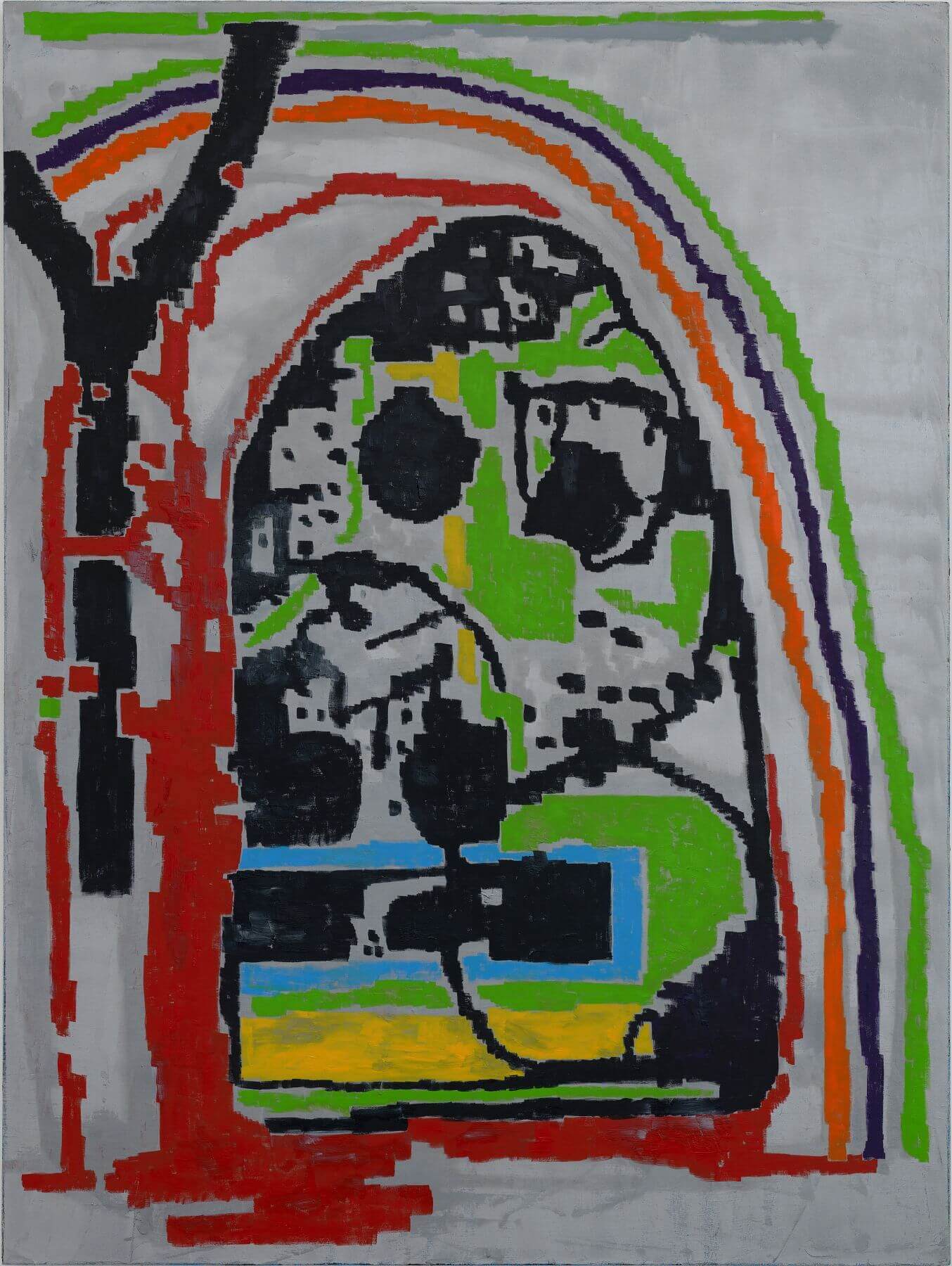
Interview with Avital Burg
PT Feature
Clear as Doubt: Bernardo Siciliano at Aicon Gallery
PT Feature
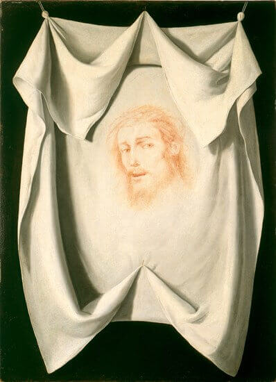
Zurbarán’s Veil of Veronica at the MFAH
PT Feature
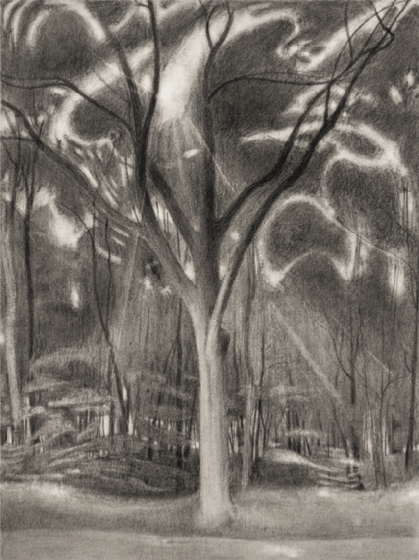
Treedom: Ron Milewicz at the New York Studio School
PT Feature
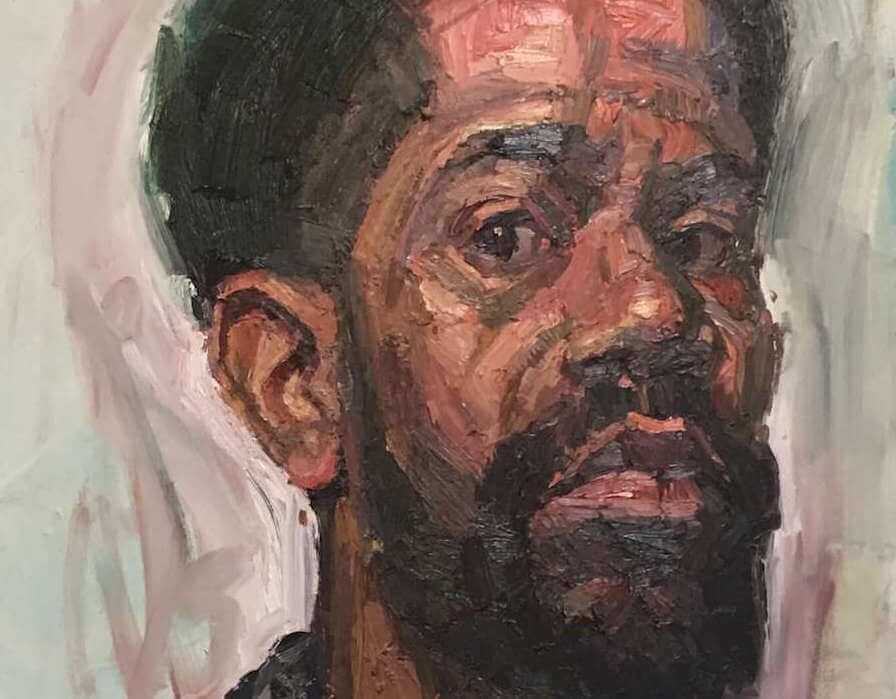
Interview: Sedrick Huckaby at the Elaine de Kooning House
PT Feature
Seen in New York, January 2019
PT Feature
Mimesis Unbound: Noah Buchanan at Dacia Gallery
PT Feature
Shared Experience
PT Feature
Patrilineations: Jane Fine at Pierogi
PT Feature
Interview with Janice Nowinski
PT Feature
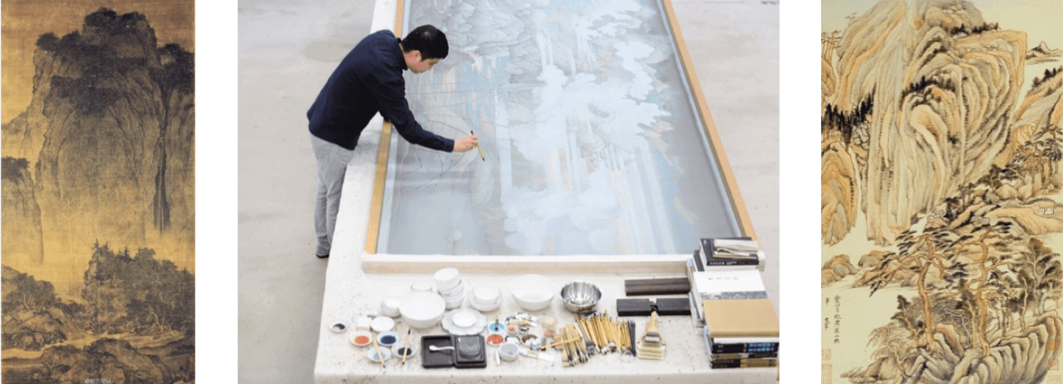
Back to the Future: Hao Liang at Gagosian
PT Feature
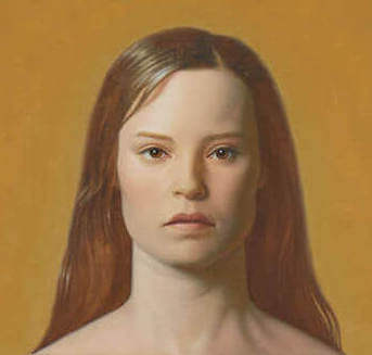
Designing Women: Kurt Kauper at Almine Rech
PT Feature
Brett Baker, New Paintings @ Elizabeth Harris Gallery
PT Feature
Sensate Wisdom: Vincent Desiderio at Marlborough
PT Feature
Sex Object Lesson: Lisa Yuskavage at David Zwirner
PT Feature
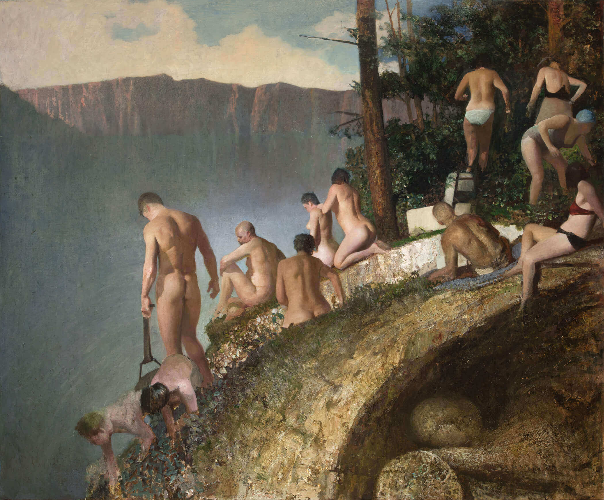
A Road Trip and the American Landscape
PT Feature
‘Let it be felt that the painter was there…’
PT Feature
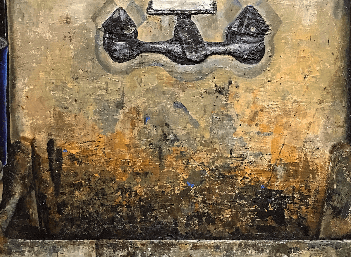
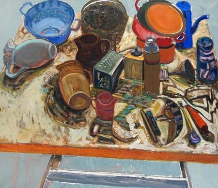
Paying Attention to Sinks and Such
PT Feature
Power Color: Peter Saul at Mary Boone
PT Feature
Painting’s Place: Susan Lichtman at Steven Harvey
PT Feature
Ginny Casey: Built From Broke at Mier Gallery
PT Feature
Object Permanence: William Bailey at the Century Club
PT Feature
Julian Hatton’s Free Range Abstraction
PT Feature
Dana Gordon: New Painting @ Sideshow Gallery
PT Feature
Refiguring the Grid: Ann Gale at the Fralin Museum
PT Feature
Just Looking at Art Basel Miami Beach
PT Feature
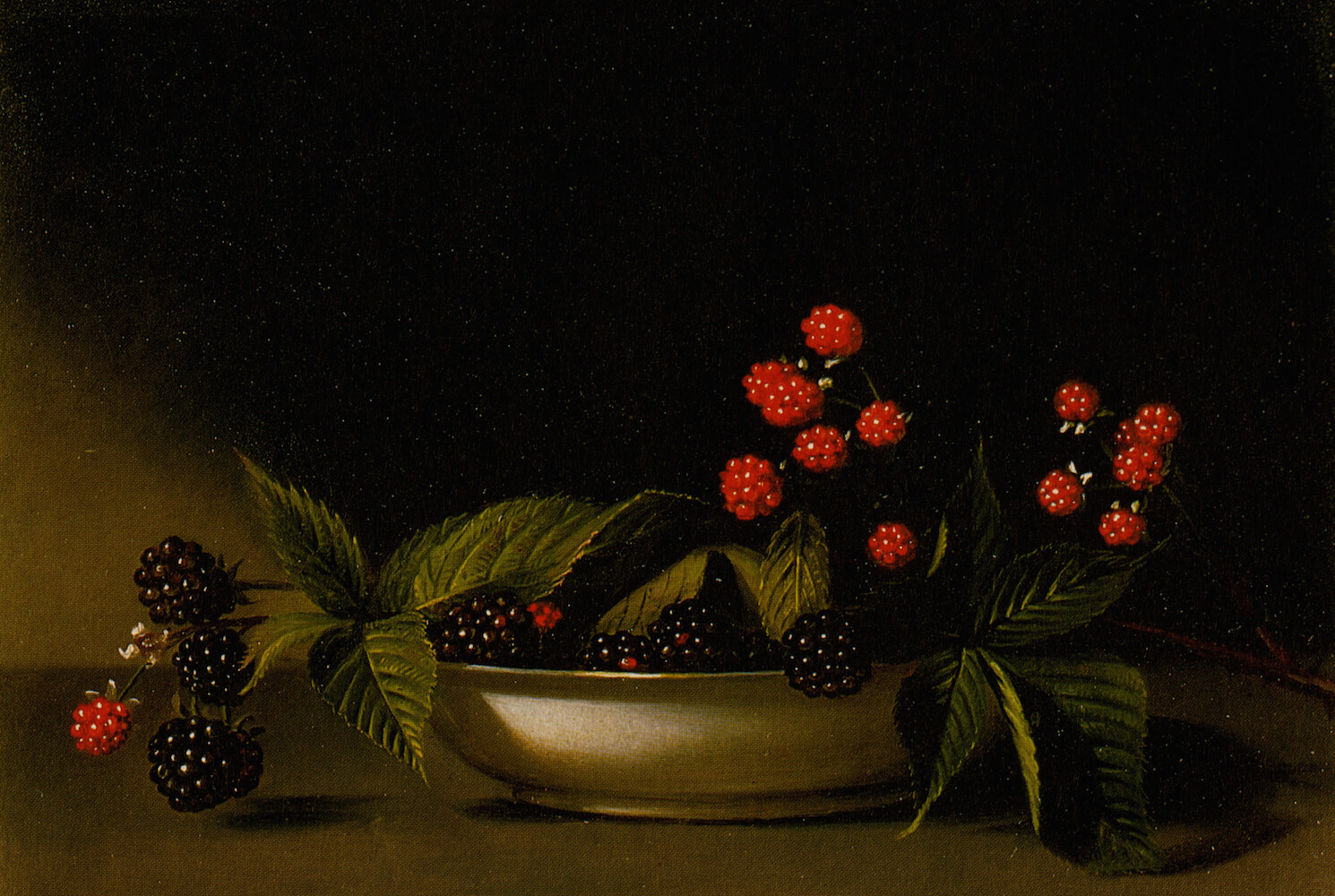
Audubon to Warhol: The Art of American Still Life
PT Feature
Visions and Revisions: Stanley Lewis at NYSS & Betty Cuningham
PT Feature
Pictures in Portraiture – Jonas Wood at Anton Kern
PT Feature
Seen in New York, September 2016
PT Feature
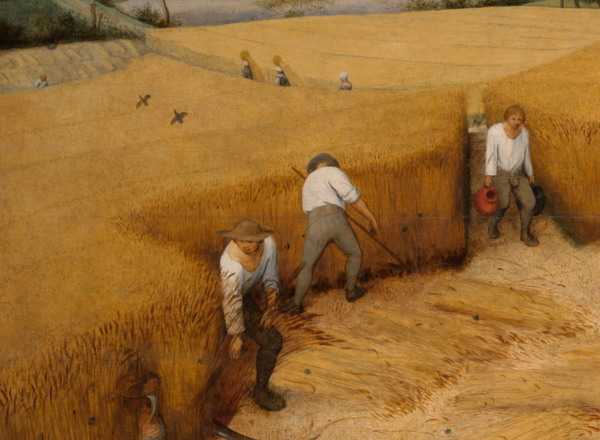
On Bruegel’s The Harvesters
PT Feature
A Conversation with Emil Robinson
PT Feature
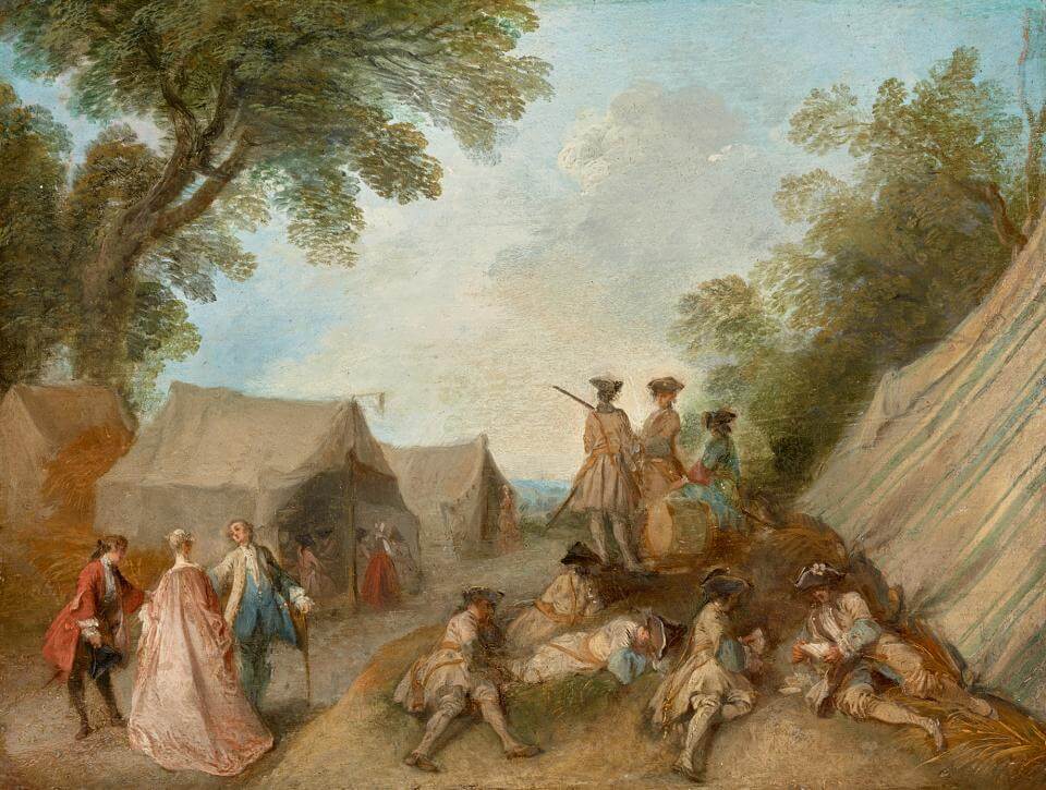
Watteau’s Soldiers @ the Frick Collection
PT Feature
Submit a Blog
PT Feature
On Painting & Painters’ Table @ The New York Studio School
PT Feature
The Abstract Image: Panel Discussion
PT Feature
Craig Manister: Painting the Rhythm of Perception
PT Feature
Helen O’Leary: The Shelf Life of Facts
PT Feature
Maud Gatewood @ UNC Greensboro
PT Feature
John Hoyland @ Newport Street Gallery, London
PT Feature
Pat Steir: Painting in Vermont
PT Feature
Seen in New York, September 2015
PT Feature
Eating Painting
PT Feature
Brett Baker: Recent Paintings @ Elizabeth Harris Gallery
PT Feature
Stanley Whitney: Care of the Brush
PT Feature
Andrew Seto: The After Life of Paintings
PT Feature
Pat Passlof: Paintings from the 50s
PT Feature
Katherine Bradford: Shelf Paintings
PT Feature
John Walker at Alexandre Gallery
PT Feature
What’s at Stake for Abstract Painting Today?
PT Feature
The Late 1960s, Working for Tony Smith and George Sugarman
PT Feature
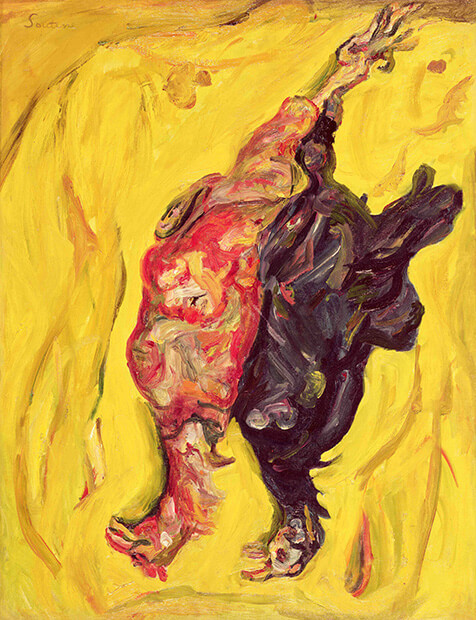
Soutine: Art More Like Life
PT Feature
Abstract Critical: Round-up
PT Feature
Yearning Upwards, Painting Trees
PT Feature
John Bunker: Interview
PT Feature
Brenda Goodman: Interview
PT Feature
Stephanie Pierce: Sight & Sound
PT Feature
Ying Li: Foreign Terrain
PT Feature
Milton Resnick: Painting to Live
PT Feature
From Edwin Dickinson to the Perceptual Painters
PT Feature
Grand Gestures
PT Feature
Conversation with Alfredo Gisholt
PT Feature
The Ability of Paint
PT Feature
Leon Kossoff: Seeing Differences
PT Feature
David Rhodes: Schwarzwälde
PT Feature
See It Loud: Seven Post-War American Painters
PT Feature
The Edge and a Little Beyond
PT Feature
Conversation with Zachary Keeting
PT Feature
Joanne Freeman: In Conversation
PT Feature
DeShawn Dumas: Interview
PT Feature
Braque at the Phillips Collection
PT Feature
Justice to Pissarro
PT Feature
Terrific Twosomes
PT Feature
Ying Li: What’s In Front of Me
PT Feature
Certain Densities in Perceptual Painting
PT Feature
Jon Imber’s Painterly Freedom
PT Feature
Nicolas de Staël: Needs to be Seen
PT Feature
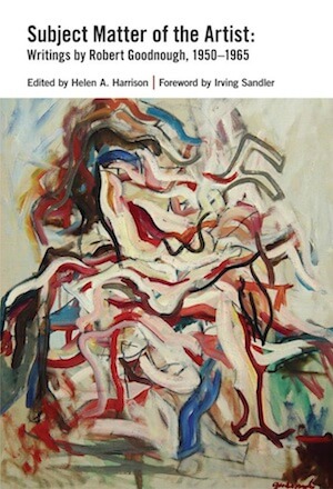
Robert Goodnough: Subject Matter of the Artist
PT Feature
Carrie Moyer: Studio Visit
PT Feature
Halsey Hathaway: Interview
PT Feature
Al Held’s Visual Thresholds
PT Feature
Conversation with Megan Marlatt
PT Feature
Alan Uglow: Object & Image
PT Feature
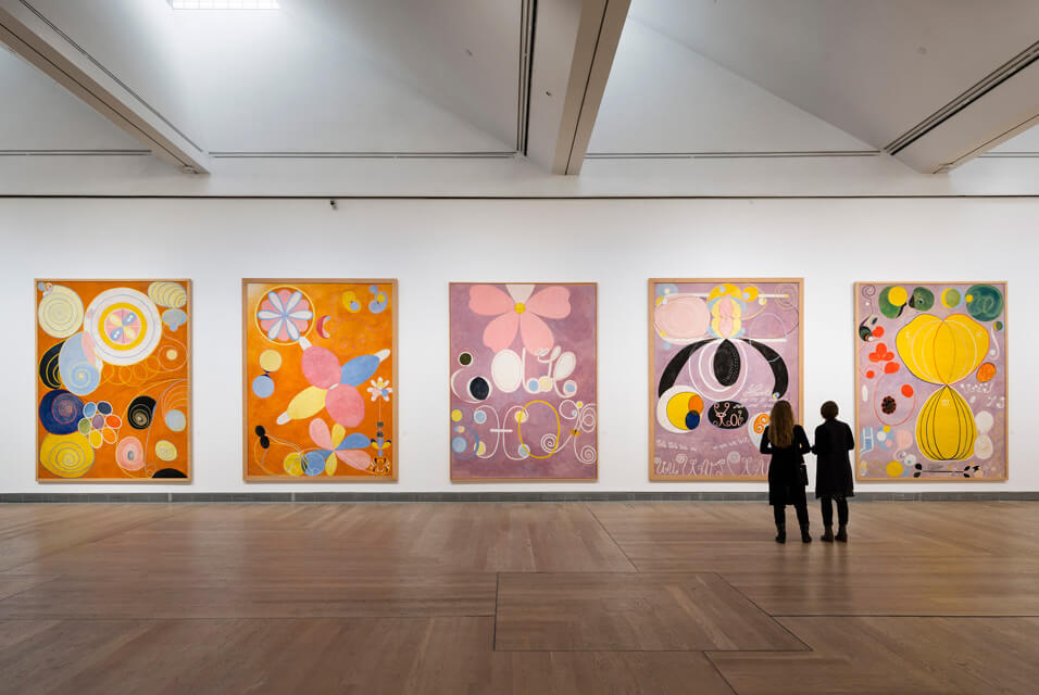
Hilma Af Klint: Paintings for the Future
PT Feature
Trent Miller: Interview
PT Feature
Jay DeFeo: Chancing the Ridiculous
PT Feature
Brett Baker: Paintings at Elizabeth Harris Gallery
PT Feature
Eugène Leroy: Subjects & Surroundings
PT Feature
Catherine Murphy: Object & Information
PT Feature
John Bellany’s Human Image
PT Feature
Margaret McCann: Interview
PT Feature
Bridget Riley: Repetition, Rhythm, & Learning to Look
PT Feature
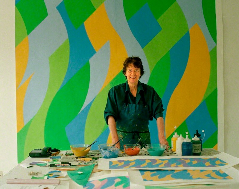
Gillian Ayres: Video Interview
PT Feature
Per Kirkeby at the Phillips
PT Feature
Bernard Chaet (1924 – 2012)
PT Feature
Tenses of Landscape
PT Feature
George Hofmann’s Instant Awareness
PT Feature
Focusing the Field
PT Feature
Nick Miller’s Truckscapes
PT Feature
Frederick Hammersley: Studio Visit
PT Feature
Judy Glantzman: In Studio
PT Feature
Jan Müller’s Abstract Tale
PT Feature
A Conversation With Patrick Jones
PT Feature
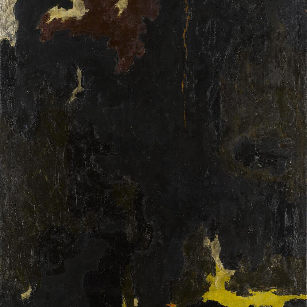
The Drawings of Clyfford Still
PT Feature
Gordon Moore: On His Work
PT Feature
Dazzling Darkness
PT Feature
Per Kirkeby On His Work
PT Feature
David von Schlegell: Paintings
PT Feature
Siri Berg: All About Color
PT Feature
Ray Parker’s Meta-World
PT Feature
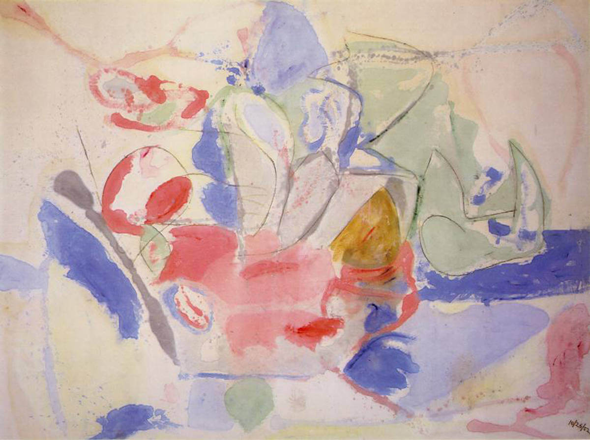
Helen Frankenthaler (1928-2011)
PT Feature
Re-Generation: Josef Albers’ Legacy of Teaching
PT Feature
Julian Stanczak: Great Colorist
PT Feature
Perle Fine: The Cool Series
PT Feature
Celebrating One Year of Painters’ Table
PT Feature
Clyfford Still Museum: The Exception
PT Feature
Milton Resnick Speaks
PT Feature
Ted Stamm: Paintings at Minus Space
PT Feature
Gabriel Laderman on Art
PT Feature
Budd Hopkins (1932 – 2011)
PT Feature
Kayla Mohammadi: Interview
PT Feature
John Hoyland (1934 – 2011)
PT Feature
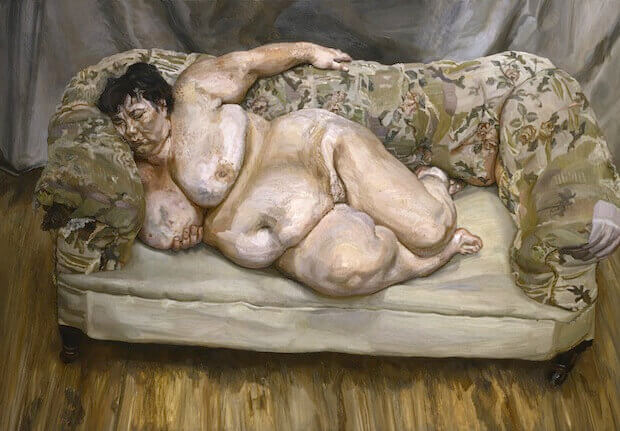
Lucian Freud: Last Look
PT Feature
Clyfford Still: “Pure Painting”
PT Feature
Cy Twombly Remembered (1928-2011)
PT Feature
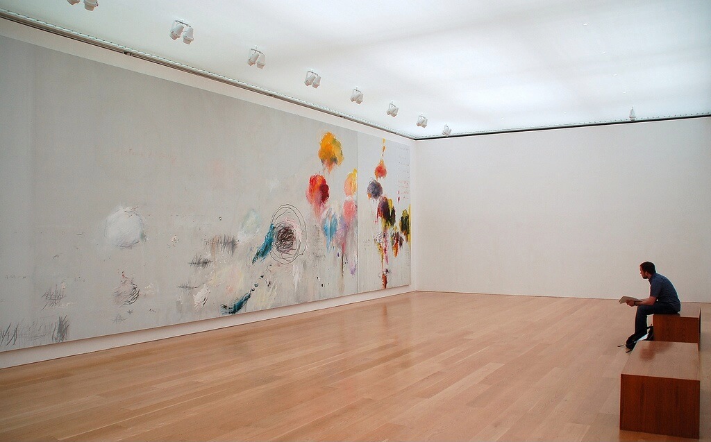
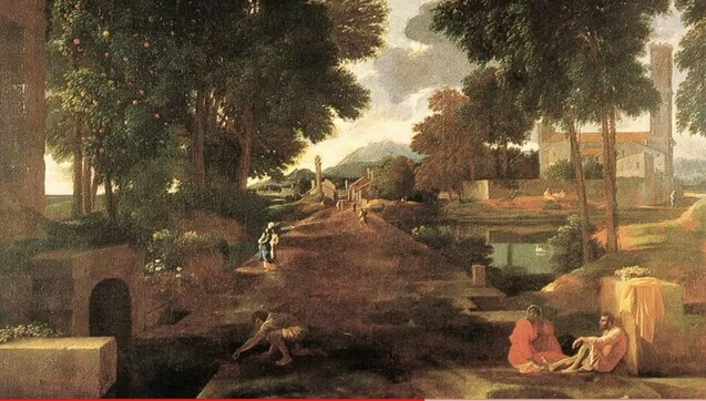
Twombly & Poussin: First Look
PT Feature
Charline von Heyl Lecture
PT Feature
Painters’ Table Most Popular Posts: April
PT Feature
Interview with Painters’ Table Editor Brett Baker
PT Feature
Painters’ Table Most Popular Posts: March
PT Feature
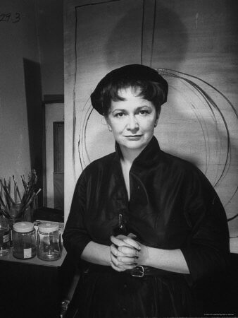
Hedda Sterne (1911 – 2011)
PT Feature
Painters’ Table Most Popular Posts: February
PT Feature
We Look on Colored Surfaces
PT Feature
Clyfford Still: A Life in Paintings
PT Feature
Painters’ Table Most Popular Posts: January
PT Feature
Painters’ Table Top Posts of 2010
PT Feature
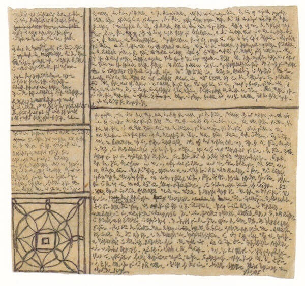
Robert Walser’s Microscripts
PT Feature
Welcome to Painters’ Table!
PT Feature
Homepage